Department Accent Palette
Overview
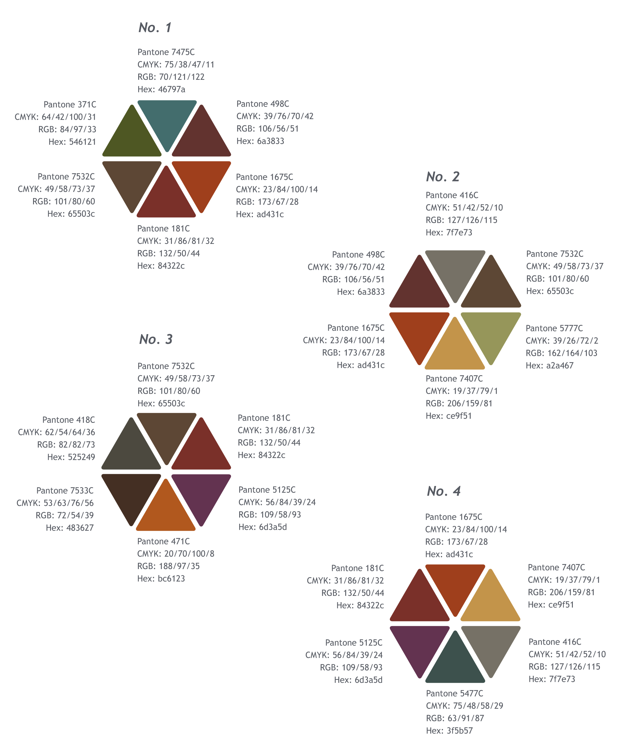
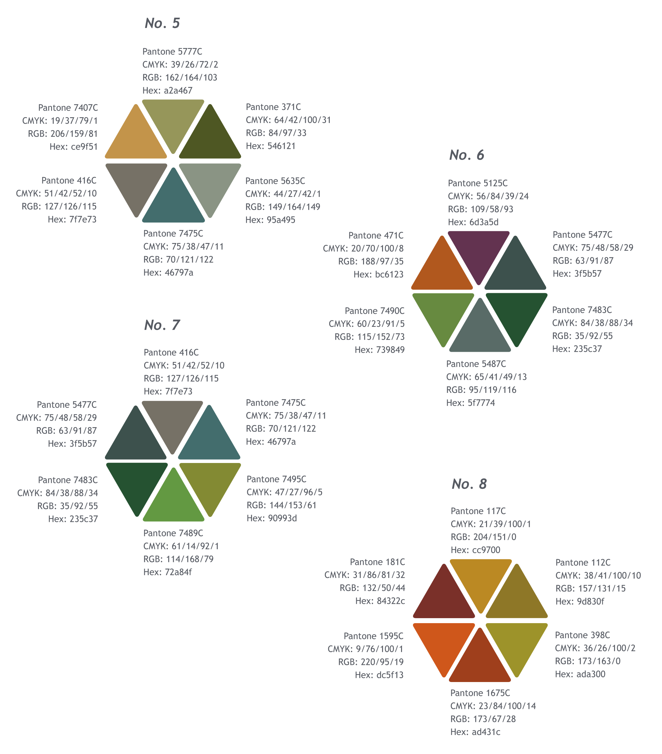
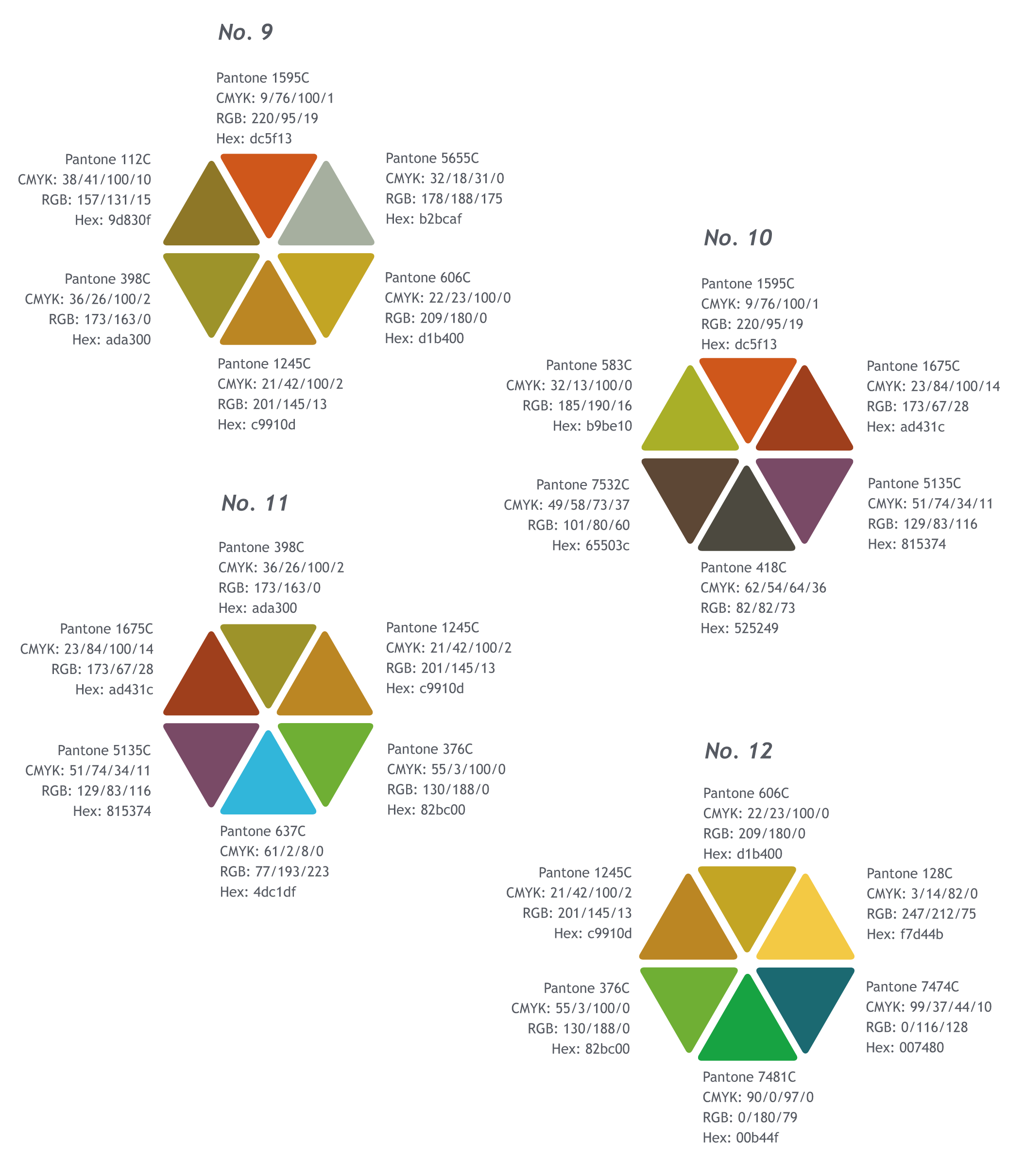
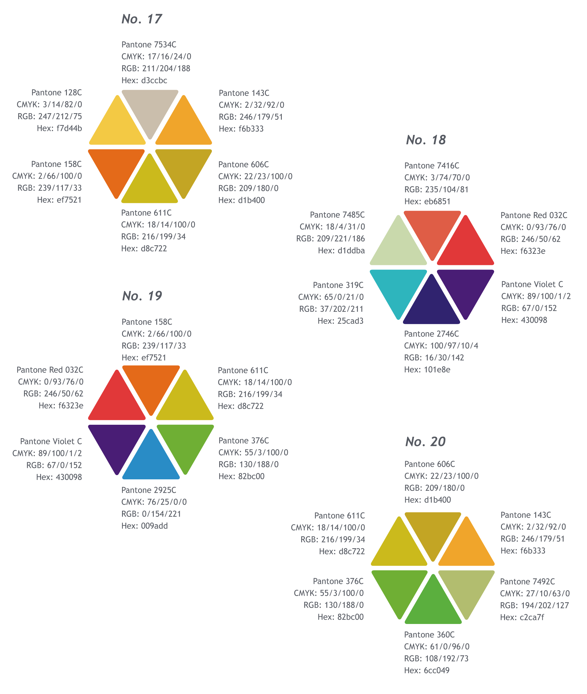
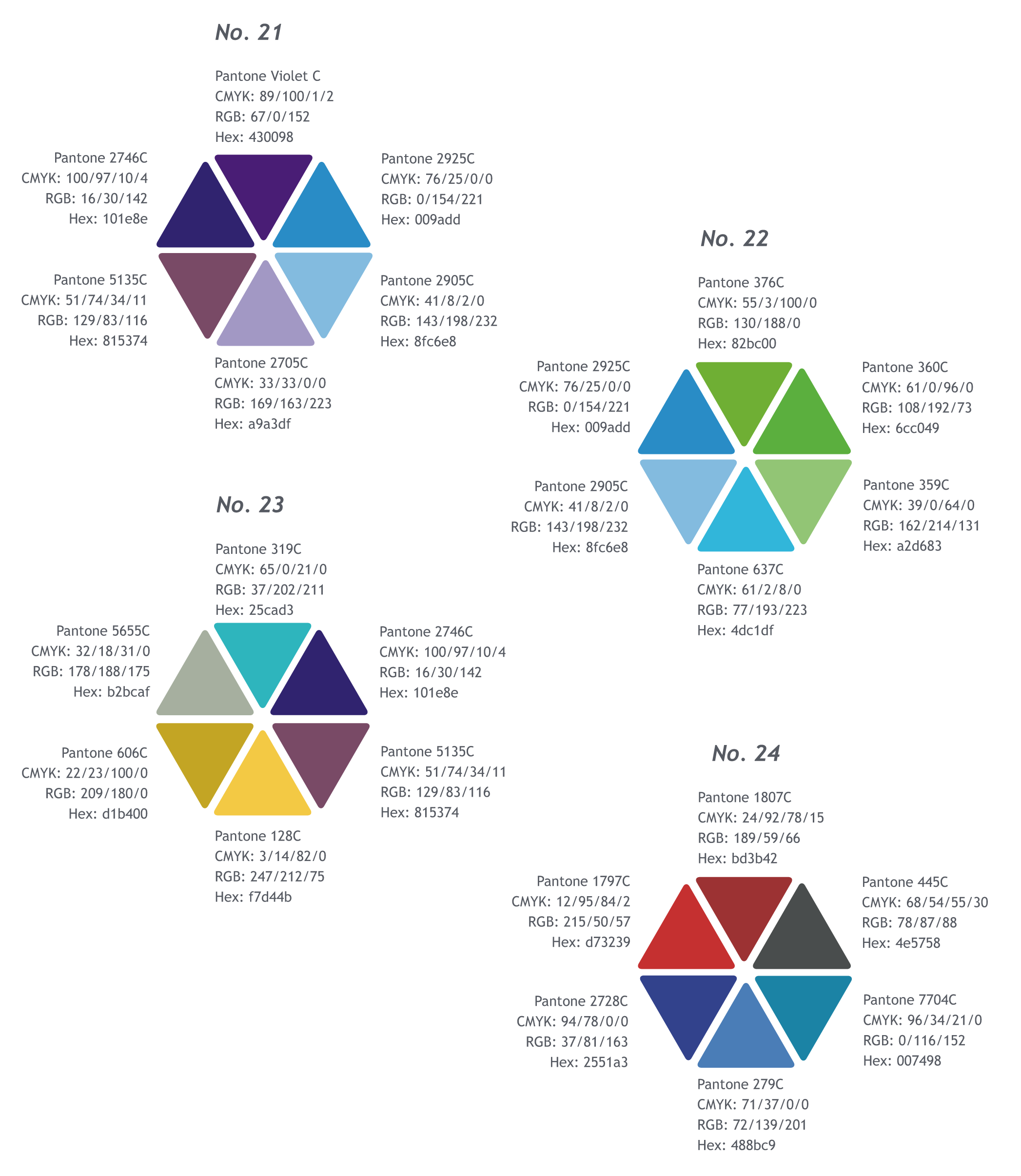
The Department Accent Palette provides a range of colors inspired by the nature, humanity and innovation found in Colorado. The palette integrates earth tones, mid tones and vibrant tones, all of which harmonize with the brand's Primary Color Palette. There are more than two dozen palettes within the overall accent palette shown below as hexagons. Each department is encouraged to select a hexagonal palette to use as accents to the brand's primary colors. However, selecting individual colors from this broad spectrum is acceptable. Departments can develop a unity among divisions by adhering to the same accent colors. Deploy the department's accent colors in addition to the Colorado master brand's primary colors. Use of colors from the previous primary palette is also acceptable, but it is recommended to feature a few colors from the current brand.
Accessibility and Color Key
A = Palette Colors with "A" indicate the color meets WCAG AA accessibility standards for contrast.
a = Palette Colors with "a" indicate the color passes WCAG AA accessibility standards for contrast ONLY when used on large type (18pt or more).
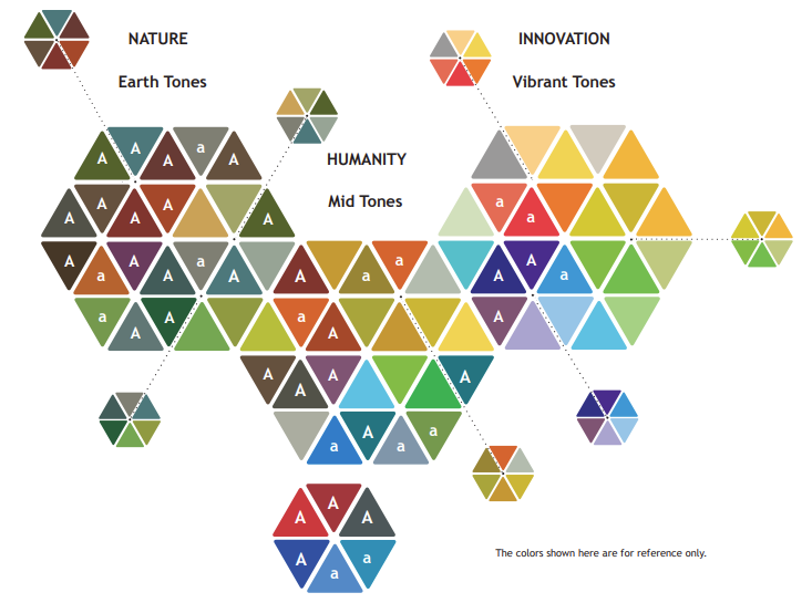
The colors shown here are for reference only. For accurate representation of color output on professional printers, please contact DPA_IDSCustomerService@state.co.us to request a hardcopy color proof.
Accessibility and Color Tip
When you use color, ensure it has an appropriate contrast ratio. Use this color contrast checker tool to determine if you are meeting accessibility standards.
The Department Accent Palette (Nature/Earth Tones)
The Department Accent Palette (Humanity/Mid Tones)
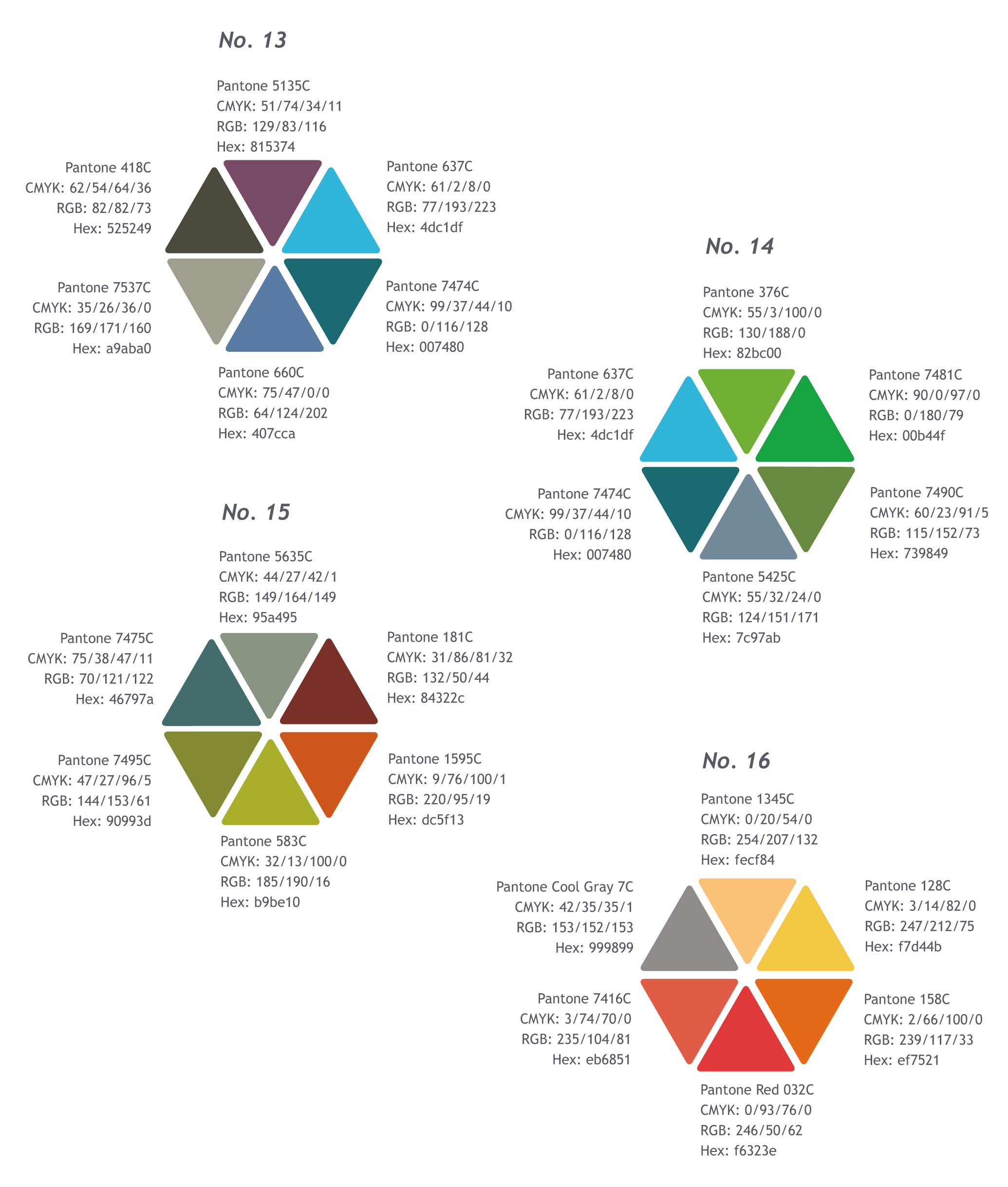
The Department Accent Palette (Innovation/Vibrant Tones)
Join Our IDS Services Newsletter
Customer Account Management Team
Denver: Email DPA_IDSCustomerService
Pueblo: 719-948-0053 | Email DPA_IDSCustomerService
IDS Hours of Operation
Northern Region/Denver - 7:00 a.m. - 5:00 p.m. | Mon. - Fri.
Southern Region/Pueblo - 8:00 a.m. - 5:00 p.m. | Mon. - Fri.