Department Logo & Lock-up Treatments
Colorado Master Brand
The strength of the Colorado brand lies within the equity of the master brand logo — the C. Our marketing efforts will focus on establishing this equity.

Colorado Department Shield
Most departments have a unique Emblem to represent their department identity. The department Emblem is to be paired with the C logo as shown here and later in this document.

Colorado Department Lock-up
Most departments and offices within Colorado have a primary logo lock-up that includes the C, Emblem and a text treatment to the right. The C and Emblem lock-up is the most common type of department lock-up. Vertical versions can be requested by contacting IDS. Other lock-up options are shown later in this section including C-only and State Seal lock-ups.
Lock-ups serve as the unique graphic identifier for each department or office and should be used comprehensively across any given department or office and should not be modified or created internally.
Please contact IDS for brand creation/modification or to update brands on your department's branding Google Drive. This ensures that correctly made brands will be available for everyone in the future.

Department Emblem Architecture
A unique Emblem has been created for the majority of the State's departments and offices and is available from your department's Communications/PIO Office. Each Emblem is an expression of the work that department or office conducts and the people they serve. The consistent shape of each Emblem lends visual continuity to our State government while allowing for individuality from one department to the next through unique iconography.
The Parts of a Emblem
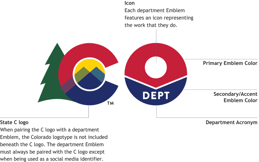
Department Logo/Lock-up Architecture
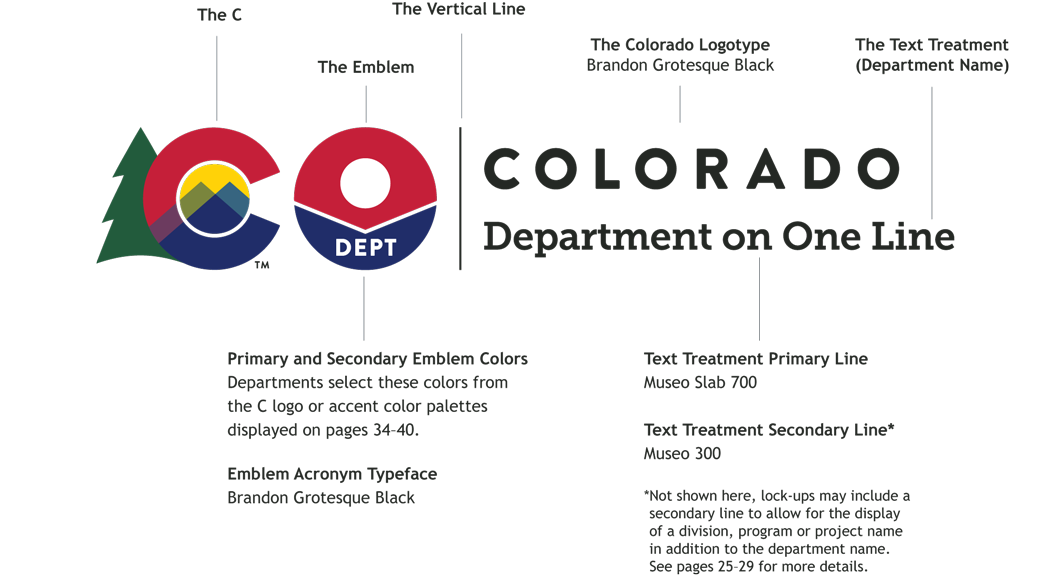
A logo lock-up (also referred to simply as a "lock-up") is made up of several elements. These elements are locked into position to form a single unit and should not be altered or rearranged. The elements of the most commonly used department lock-up type — the C and Emblem — are identified and described below.
The Parts of a Logo/Lock-up
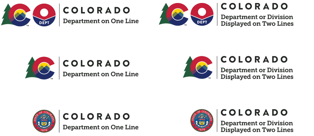
Department Logo/Lock-up Text Treatment
A department name may require one or two lines in a logo lock-up depending on the length of the name. The maximum width of a department name is 3.2 x the width of the State C logo (measured from the left edge of Colorado logotype). When a single line exceeds this width, the two-line format should be used. In addition to the most commonly used lock-up type — the C and Emblem — we've illustrated C-only and State Seal lock-up examples for department names below.
Department Logo/Lock-up Color Reverse Applications
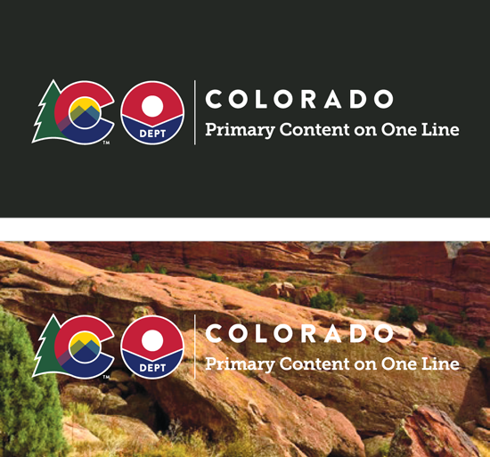
The color reversed logo lock-up (or the white-only version on the next page) can be used when placing the logo on a colored background, over a photograph, or when it is helpful to achieve a balanced layout.

Department Logo/Lock-up White Only Applications
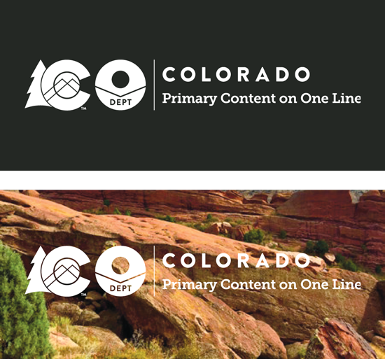
The white-only logo lock-up can be used when the logo is used on very busy or colorful background that would detract from the brand, to simplify the appearance.

Department Logo/Lock-up Black & White Applications
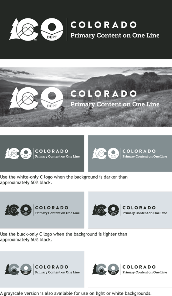
When color is not available, it is acceptable to use the white-only logo lock-up to print on dark backgrounds. Use this version when the background is approximately 50% grayscale or darker. When the background is lighter than 50% grayscale, use the black-only logo lock-up. On very light backgrounds, the grayscale version is also acceptable.
Department Logo/Lock-up Clear Zone
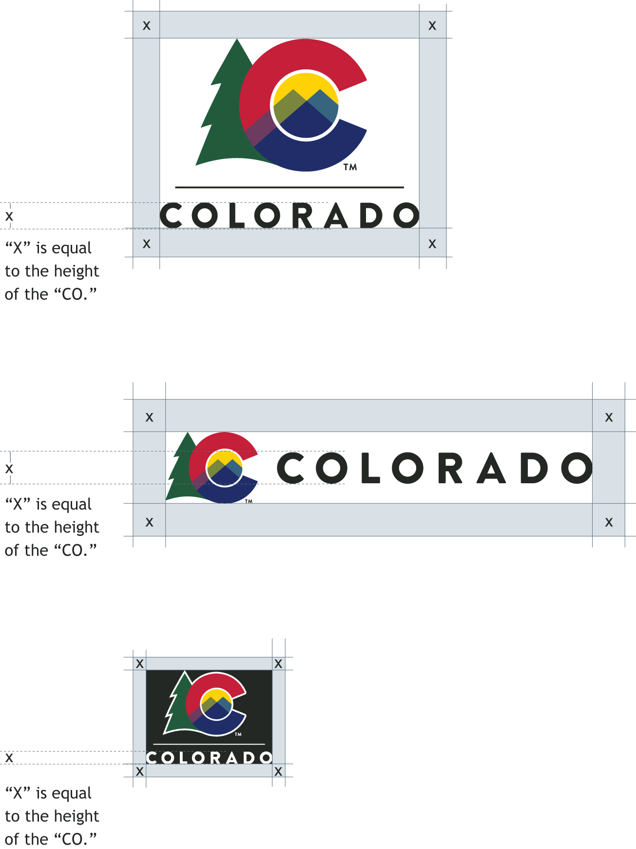
The department, division, project, and program logo lock-up should always have a clear zone surrounding it in order to maintain its integrity.
Leave a clear zone equal to "x" or greater, where "x" is equal to the height of the "COLORADO" logotype. When possible, leave more clear space than the minimum indicated here.
Department Logo/Lock-up Minimum Size
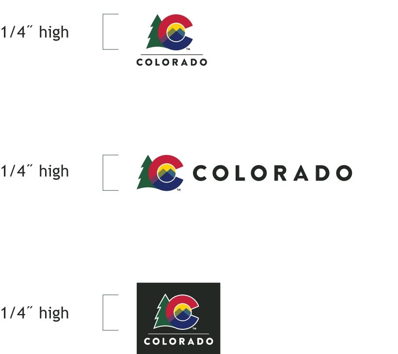
Only use the logo lock-ups at 1/4˝ or larger in height, with the "height" defined by the height of the C logo. Measure from the base of the C logo to the top of the C logo.
Always try to use the brand in larger sizes for increased legibility. The minimum sizes are only for the highest resolution reproduction methods possible where more space is unavailable. Its use does not apply to low-resolution processes like those found on webpages.
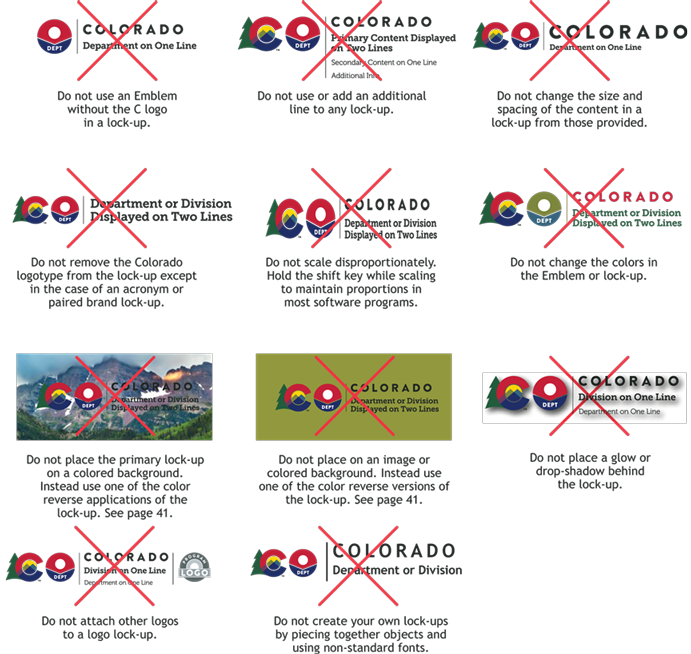
Department Logo/Lock-up Don'ts
Spanish Translation Guidance for Your Department Logo
Use a minimum 11pt Trebuchet, 1.5 line spacing, and proper clear space equal to height of the word COLORADO. Please insert the appropriate translation for your unique department, division, office, or program. For example:

Join Our IDS Services Newsletter
Customer Account Management Team
Denver: Email DPA_IDSCustomerService
Pueblo: 719-948-0053 | Email DPA_IDSCustomerService
IDS Hours of Operation
Northern Region/Denver - 7:00 a.m. - 5:00 p.m. | Mon. - Fri.
Southern Region/Pueblo - 8:00 a.m. - 5:00 p.m. | Mon. - Fri.
