The Elements

State Seal | State Flag | State Logo | Brand Identity Elements | Primary Logo | Reverse Applications | Horizontal Logo | Clear Zone | Minimum Size | Don'ts | Primary Color Palette | Typefaces | Type Treatments | Photography
Like Colorado itself, our logo combines the familiar with the unexpected. It draws clear influence from our world-famous mountains and beloved license plate. But its shape, an upward facing arrow with rounded corners, also serves as a symbol of Colorado's momentum and a reminder of its friendly and approachable attitude. While our identity certainly isn't everything Colorado is, it will serve as a constant and consistent reminder of everything our spectacular state can be.
The State of Colorado identity is made up of three distinct images: the State Seal, the State Flag and — the newest addition — the State Logo. Each serves a unique purpose and should be deployed in communications accordingly.
State Seal
The State Seal is for use by elected officials in their communications, as well as for conducting enforcement and serious government business.
Using the State Seal
The State Seal is used exclusively to communicate the authority of the state government. Use of the Seal requires permission from the Colorado Secretary of State. Requests for use must be submitted in writing to the Secretary of State's Office at www.sos.state.co.us.
When to consider using the State Seal
Communications from elected state officials such as the Governor's Office and the Colorado General Assembly, along with law enforcement, corrections and on documents such as tax notifications, certificates, vital records and contracts.
Rules governing use of the State Seal
- The actual Seal itself, when measuring two and one-half inches in diameter, can only be used by the Secretary of State in an official capacity.
- A copy of the Seal that is any size except two and one-half inches in diameter can be used by a department, organization or group that is authorized or established by an arm of the state of Colorado for official state functions, or for educational purposes.

State Flag
The State Flag is for connecting with Coloradans on a citizen to citizen basis. The State Flag is public domain.
Using the State Flag
The State Flag is public domain. All citizens have the privilege of use in occasions they deem fitting and appropriate.
When to consider using the State Flag
Non-official state business, ceremonies and events.

State Logo

The State Logo (aka, the C) is for everyday government business and marketing communications and should be used broadly.
Using the State Logo
The C logo is for use by all state departments, offices, divisions, programs and projects. The logo should be utilized by state employees as the default marketing and communications tool. All applications of the logo should adhere to the brand guidelines outlined herein.
When to use the State Logo
All day-to-day marketing and communications from the Colorado state government including but not limited to: business cards, letterhead, brochures, marketing pieces, presentations, signage, digital assets, and uniforms.
The State Logo

Department Lock-up

Horizontal Logo

State of Colorado Logo

Color Palette & Typography

Certification Badge

Primary Logo
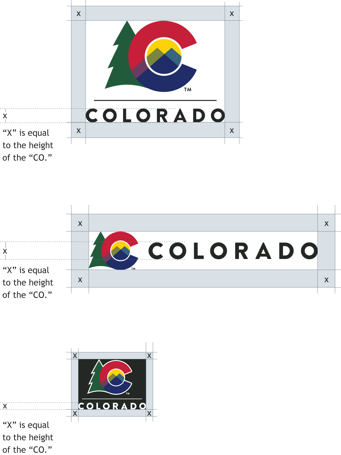
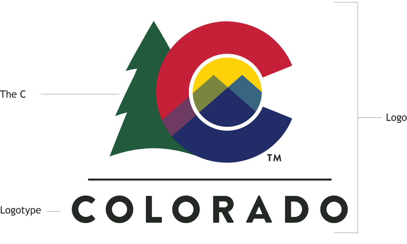
The State Logo consists of two elements that should normally appear together (except when being paired with a department emblem or other graphic element, or when used as an icon or social media identifier): the C icon and the logotype. The stacked configuration shown here is the preferred configuration. However, it is acceptable to use the horizontal configuration at the aesthetic preference of the designer.
The relationship of these elements should not be modified. When sizing the C logo, be sure the logo elements are scaled proportionately. Artwork for the C is available in the drive shared folder.
Reverse Applications
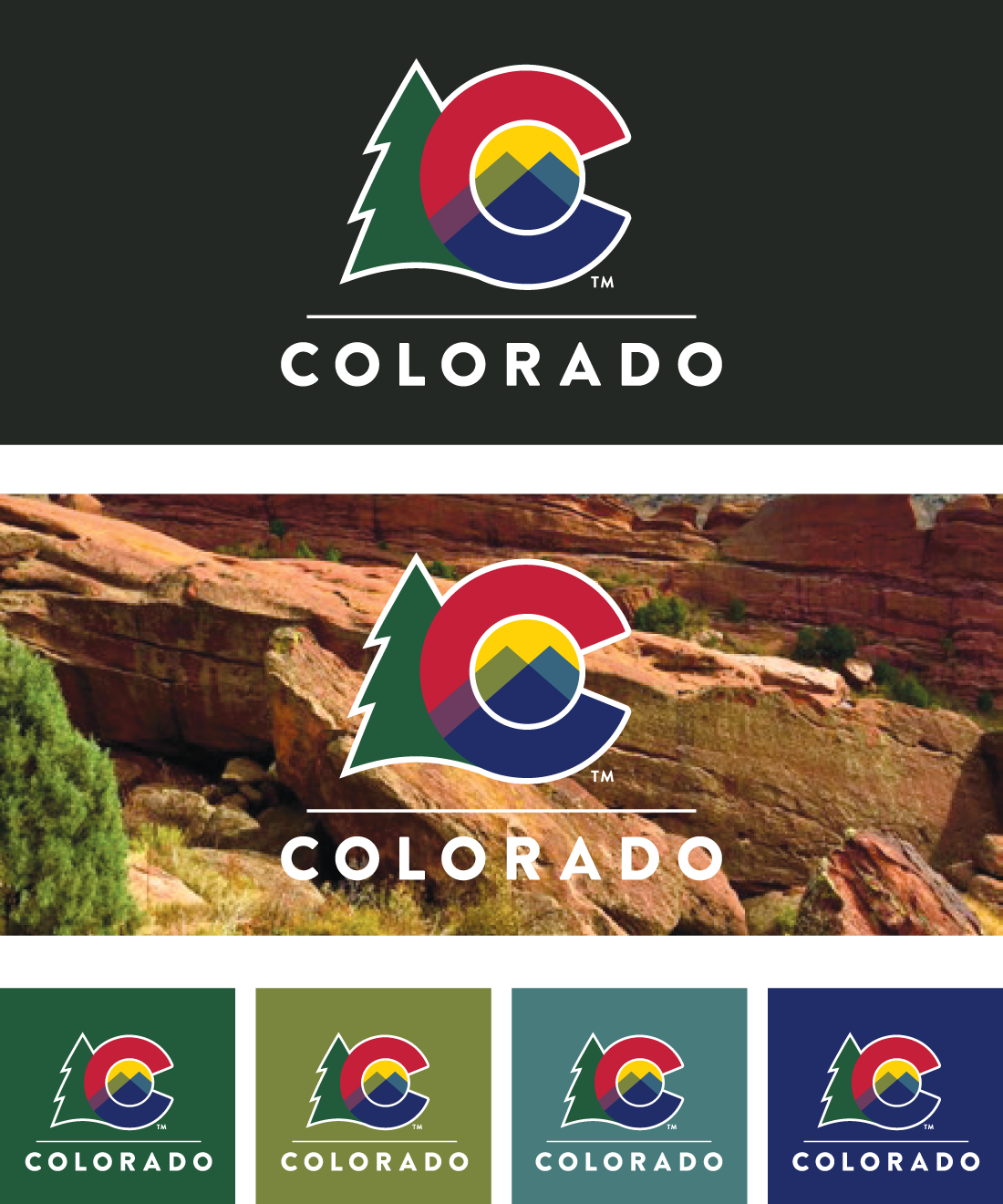
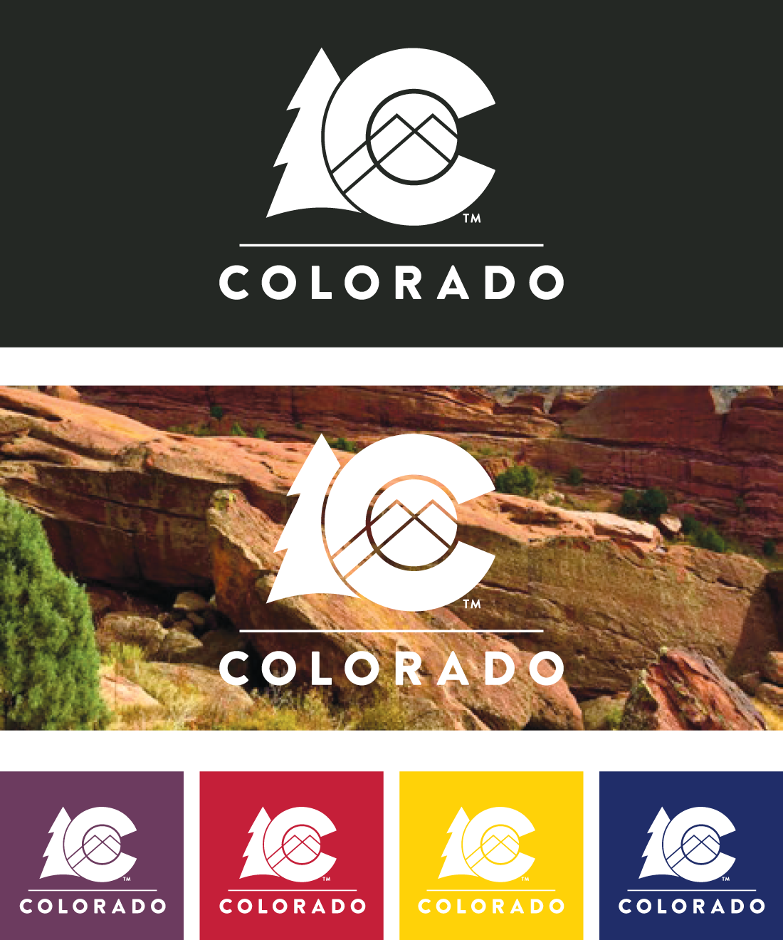
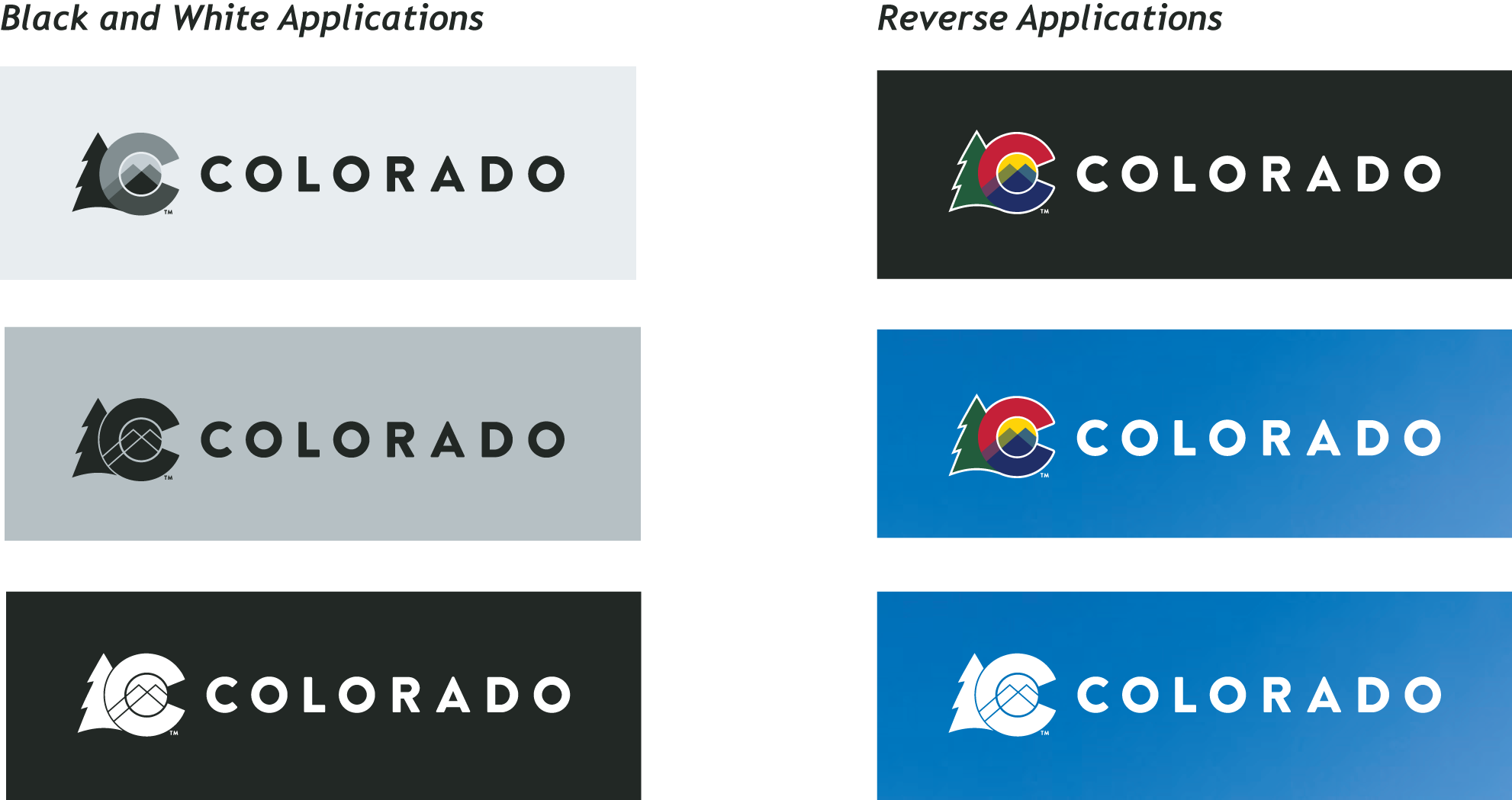
When printing the C logo on dark or vivid backgrounds, use the color reversed logo or the all white option.
Color Reverse Logo
The outline used in the color reversed version provides increased separation between the logo and the background. The type color is changed to white.
White-Only Logo
The white C logo can be used when the logo is used on a very busy or colorful background that would detract from the brand, to simplify the appearance.
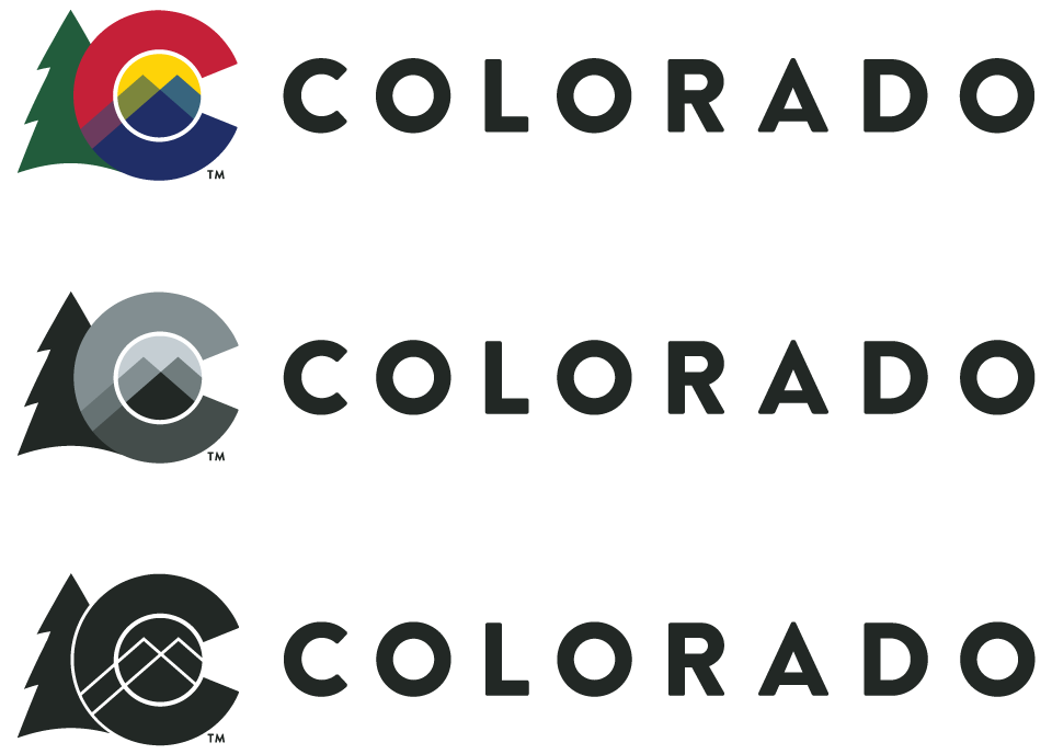
Horizontal Logo
Use the horizontal C logo when the primary logo configuration does not fit comfortably in the space available, or at the aesthetic preference of the designer. Here again, both elements of the logo (C and logotype) must always be used together without modification to the relationship between the elements.
Minimum Size
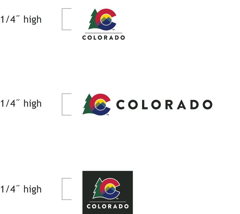
Only use the C logo 1/4˝ or larger in height in any logo configuration. Measure from the base of the C to the top of the C. For the color reverse version, measure from the outside of the outline.
Always try to use the brand in larger sizes for increased legibility. The minimum sizes are only for the highest resolution reproduction methods possible where more space is unavailable. Its use does not apply to low-resolution processes like those found on webpages.
Logo Don'ts
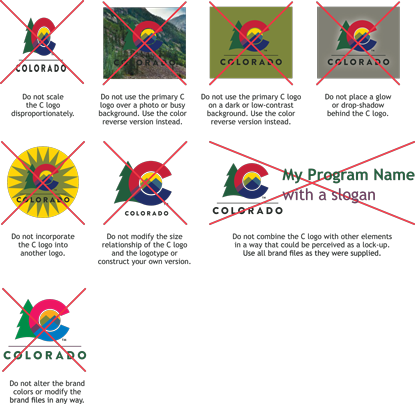
Please don't scale the C logo disproportionately, incorporate the C logo into another logo, modify the size relationship of the C logo and the logotype, or construct your own version. Please don't combine the C logo with other elements in a way that could be perceived as a lock-up. Use all brand files as they were supplied. Please don't alter the brand colors or modify the brand files in any way.
When placing the C logo on dark-colored, low-contrast, or photographic backgrounds, please don't choose the primary C version. Use the color reverse version instead. Also don't place a glow or drop-shadow behind the C logo.
Primary Color Palette
The State Logo provides a palette of colors for all Colorado communications. Consider featuring a few brand colors in your communications. In addition to these primary colors, each department can select several individual accent colors or choose a color grouping from the Department Accent Palette (see Brand Department Section). And because the previous primary palette is so commonly used and extends the hue and value range available, it is also acceptable to use them.
Accessibility and Color Key
- A = Palette Colors with "A" indicate the color meets WCAG AA accessibility standards for contrast.
- a = Palette Colors with "a" indicate the color passes WCAG AA accessibility standards for contrast ONLY when used on large type (18pt or more).
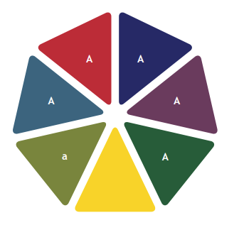
Red - PMS 200C
CMYK: 16/100/87/6
RGB: 195/0/47
Hex: c3002f
Blue - PMS 2748C
CMYK: 100/94/24/23
RGB: 0/25/112
Hex: 001970
Purple - PMS 5125C
CMYK: 56/84/39/24
RGB: 109/58/93
Hex: 6d3a5d
Tree Green - PMS 7483C
CMYK: 84/38/88/34
RGB: 36/93/56
Hex: 245d38
Yellow - PMS 109C
CMYK: 0/16/100/0
RGB: 255/209/0
Hex: ffd100
Left Mountain Green - PMS 7491C
CMYK: 54/33/96/12
RGB: 122/133/59
Hex: 7a853b
Right Mountain Teal - PMS 7699C
CMYK: 83/54/35/12
RGB: 53/100/126
Hex: 35647e
Typefaces
The state has a primary typeface, a secondary typeface, and some additional typefaces.
Primary Typeface
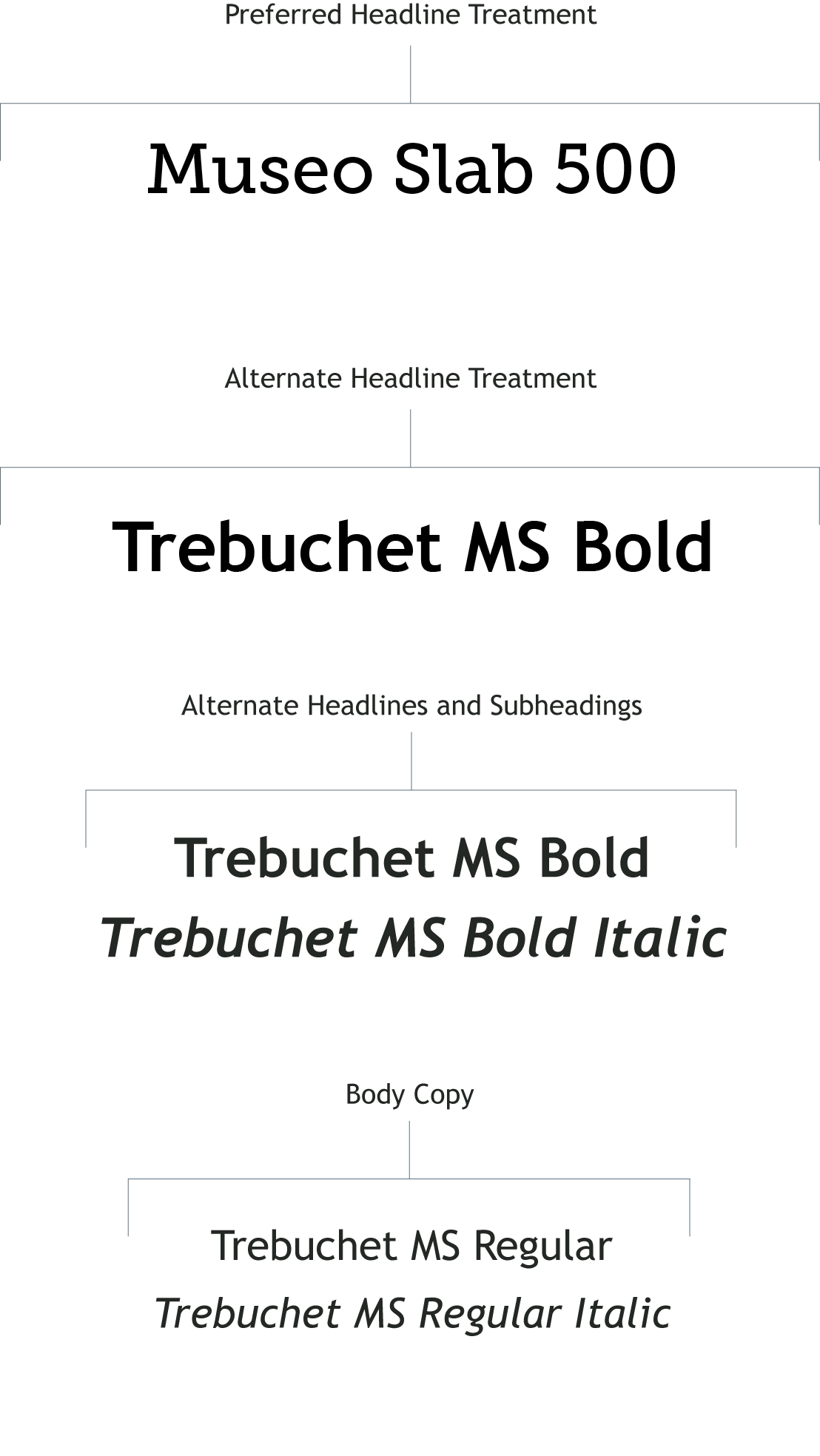
Museo Slab 500 and Museo Slab 500 Italic are the primary typefaces of the Colorado brand. Use these fonts to evoke the brand voice in headlines and titles. If Museo Slab 500 is not available, it is ok to use the secondary typeface as the primary.
Museo Slab 500 is available for download www.exljbris.com/museo.html. It is offered by the type designer at no cost.

Secondary Typeface
Trebuchet MS is the secondary typeface of the Colorado brand. Use it for alternate headlines, subheadings, body copy, detail callouts and captions.
Trebuchet MS is a system font included on Macintosh and Windows operating systems. It is designed for the web and is a standard font in Google Drive software.

Setting Type for the Web
Museo is not a system font and therefore has to be loaded on every computer that uses it. When setting type for the web, use Trebuchet MS for live html text. Use Museo for headlines that can be uploaded as images.
Text Color
While the previous branding used dark Slate gray for text, the current system prefers black. This increases contrast and accessibility and is more likely to print clearer and more consistently than gray made from multiple colors.
These Additional Fonts for Special Use are to be used primarily by designers using Adobe software and are available for purchase through most font vendors.

Type Treatments
Preferred
It is preferred to use Museo Slab 500 as the dominant headline/title font and Trebuchet MS Bold Italic as the secondary headline font.
Alternate
If Museo Slab 500 is not available, it is acceptable to use Trebuchet MS Bold as the dominant headline/title font and use Trebuchet MS Bold Italic as the secondary headline font as shown here.
Additional Font Open Sans is Available for Special Use Digital and Web Accessibility Considerations
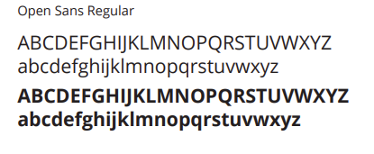
Created for Google, it is free to use with an open-source license. Open Sans has clear spacing, tall letter sizes, and rounded shapes that make the typeface easy to read. It is also available in Adobe Creative Suite. Open Sans is a Dyslexia-Friendly font.
Photography
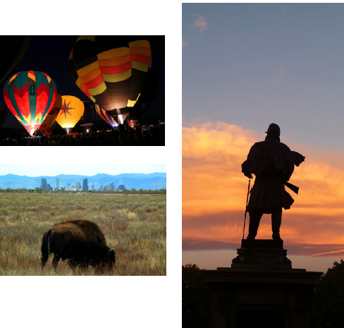
Our state is synonymous with unsurpassed natural beauty, fascinating people and ground-breaking innovation. It is important that we only use high-quality photography to portray our great state.
Quality Checklist:
- Resolution — Ensure each photo has adequate resolution for the specific media to be used.
- Focus — Either the entire photo, or just the key subject matter should be in sharp focus.
- Color Balance — Each photo should be evaluated and adjusted when necessary for accurate color balance.
- Composition — The elements in a photo should create an interesting composition of lights and darks.
- Crop — Use crop to direct attention and create interest.
- Interesting Subject Matter — Colorado is more than breathtaking landscapes. Consider showing people and industry as subject matter.
Licensing
Typically, a photograph needs to be licensed from the photographer or the stock photo agency that owns the copyright. You must pay a licensing fee to use copyrighted photographs. The licensing fee is based on the specific details regarding how the photo will be used.
Other Considerations
Look for the following areas of diversity when choosing photography:
- Ethnic
- Geographic
- Occupation/Industry
- Rural/Urban
- Socioeconomic
- Age
- Gender
- Seasons
Photo Library
IDS is looking into providing a photo library for all State Agencies to use. Please reach out to the Branding Compliance Manager for more details.

Contact the IDS Customer Service Team at DPA_IDSCustomerService@state.co.us if you have questions on the Colorado State Branding.
Join Our IDS Services Newsletter
Customer Account Management Team
Denver: Email DPA_IDSCustomerService
Pueblo: 719-948-0053 | Email DPA_IDSCustomerService
IDS Hours of Operation
Northern Region/Denver - 7:00 a.m. - 5:00 p.m. | Mon. - Fri.
Southern Region/Pueblo - 8:00 a.m. - 5:00 p.m. | Mon. - Fri.


