Layout Guidelines
Home & Landing Pages
Your homepage and landing pages should be visually appealing, highly functional, accessible, and user friendly. In order to help meet these goals, your homepage layout should:
- Have a clear visual hierarchy. Home and landing pages should be free of clutter and organized in a way that helps people get to the information they need quickly. Having a hero, using high quality headings, and exploiting your grid to arrange content can help to create a strong impression and draw the eye to important resources.
- Be consistent with our brand. Whether you rely on design tokens or the Brand Guidelines, our principles and brand elements (colors, fonts, and similar) should be present across all of your digital solutions.
- Be highly navigable. Your primary navigation, utility navigation, and search tool should be easy to identify and use. In general, these critical navigation elements should be at the top of your solution.
- Prioritize critical information. Critical content should be above the "first fold"; users should see it before they scroll on most devices. The purpose of your site or app should be made immediately obvious with a heading (in a hero, above a welcome message, or similar). Calls to action should be prominent.
- Include trust and transparency elements. Your official logo (or logo lock-up) should be prominently displayed, usually in the upper left-hand corner of your website or app. You should also think about including your contact information, last updated details (especially for content heavy pages), and third-party validation (testimonials) if appropriate.
Content Pages
Content pages are those that contain information about a specific topic. Content pages tend to include much more detailed content than home or landing pages. The layout of content pages is (and should usually be) much simpler than landing pages. Content pages should:
- Be highly navigable. Including secondary or side navigation is critical on a majority of content pages. Users should never (ever) be "stuck" on your page. Give them easy access to related content.
- Be organized. Your content, including text and images, should be presented in a logical order. Headings should be leveraged to enable people to scan content and easily find what they are looking for.
- Prioritize simplicity. Content pages - like all other page types - shouldn't be "kitchen sinks". If you need to create a complex or busy layout to present your content, the content should probably be broken up into smaller, more digestible pages.
Navigation
There are many ways that people navigate websites. Different people use different words to describe navigation.
- Navigation elements should be consistent throughout your solution.
- People should always have at least 2 ways of finding or getting to content.
- Navigation must be available regardless of the device someone is using. Check out Spacing & Grid for guidance on supporting various resolutions.
Example Navigation Elements
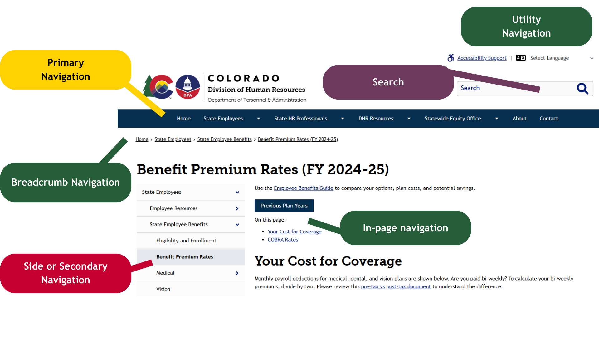
Design System Components
| Component | Also Known As | Use or Follow | Tips |
|---|---|---|---|
| Header |
| Don't try to cram everything into your primary nav. See additional guidance Information Architecture Tips. | |
| In-page Navigation |
|
| |
| Breadcrumb | Be consistent. If you are using breadcrumbs on your site, use them on every content page. | ||
| Side |
|
| Keep things organized. If you have a lot of content (more than 7 items), try to organize it into parent or container topics. |
| Footer | Don't neglect your footer! It is a very valuable navigational element. |
Tools & Search
In addition to the navigation components above, you can (and should) think about helping users quickly access tools and search. Both can help people get to the information they need more quickly and have a better experience when they do.
- Utility navigation. This type of navigation, often located in the top right corner of websites, usually includes utilities - tools and actions - like language toggles, account access options, share links, and similar.
- Search. A sitewide search option should always be available to your users (unless your site is really small). The most common placement for search is in or near the upper right corner.
Information Architecture Tips
Many websites have long lives. Different people participate in content management. Information architecture - how content is labeled and organized - can become confusing and hard to manage. If you engage in regular content reviews, or are starting from scratch, try to follow these steps when you're getting things organized:
- Always start with your user's needs. Look at your analytics, use card sorting or other techniques, create personas, and more. Your navigation should be based on the needs of your users and make it easy for them to find what they are looking for. Tip: many agencies can organize information by target audience. As an example, you might have top-level categories of "For Residents", "For Vendors", etc.
- Don't base public navigation on internal structures, knowledge, or workflows. You may know who does what in your agency. People who do not work within your agency shouldn't have to, though. Avoid the temptation to organize things by who "owns" them. Focus on sections, categories, or topics of information that prioritize the needs of your users and use common language.
- Be logical and aim for a hierarchy. Creating a hierarchy for your navigation is a lot like creating well-organized content on a single page. You start with a big idea and then distinctly and clearly discuss parts of that idea (and parts of those parts). You label each idea descriptively and briefly.
- Your top (first) level navigation should include, at most, 5-7 main categories of information. Often, people create landing pages for these categories.
- Each subsequent level of navigation should also be limited. Once you include more than 7 or so items, people may start to get overwhelmed.
- Deeper navigation is better than bloated navigation. It is okay to have a 3rd or even 4th level of navigation on your website or in your app if necessary. Keeping things well organized will make it easier for people to get around.
- Don't link to external tools in your header/primary, breadcrumb, or secondary navigation. If you need to connect people to external tools or websites, use clear calls to action somewhere else (on a landing or content page, in tertiary or footer navigation, etc.).
- Use distinct, common, and clear labels (titles) for your navigation items. People should not have to guess or wonder what they are "getting" when they engage with a menu item or link.
- As always, make sure your clickable text matches your page title.
- Avoid including unnecessary words (like "information") or being too brief (using acronyms, abbreviations, and similar).
Link Examples
| Internal Name or Reference | Purpose Served | Example Navigation Label | Notes |
|---|---|---|---|
| Center for Organizational Excellence | Learning and development opportunities | Learning & Development | Focus on the topic or outcome instead of the workgroup or program name. |
| 8 CCR 1501-11 Technology Accessibility Rules | Identify the State's technology accessibility rules | Technology Accessibility Rules | Remove confusing or obscure references. You can add necessary references to page content instead. |
| Benefits | Share information about dental benefits | Dental Benefits | Make sure to be specific, especially if the context is not made clear by a parent menu or website name. |
| Division 4 Office | Share information about an office serving a geographic location | Gunnison River Basin (District 4) | Prioritize labels that require no special knowledge and, if needed, offer clarifying references. |
| Agricultural Drought and Climate Resilience Office (ADCRO) | Share information about policies and programs related to drought and climate change | Drought & Climate Change | Keep it simple and focus on the topic of information rather than organizational structure. |
Footers
The footer, which lives at the bottom of websites and applications, deserves special discussion because it is one of the most underutilized design components. As you're creating your footer:
- Keep it clean and simple. Include the basics like copyright, contact details, social media links, newsletter signups, and access to accessibility information.
- Prioritize your user's needs. Make accessing essential pages, related sites, or tools like sitemaps clear. Arrange links by topic to make finding the right resources easy.
- Don't use it as a catch all. If you repeat your primary navigation, include irrelevant graphics, have excessive legalese, or "dump" content into your footer, its utility will be lost.
Examples
Landing Pages
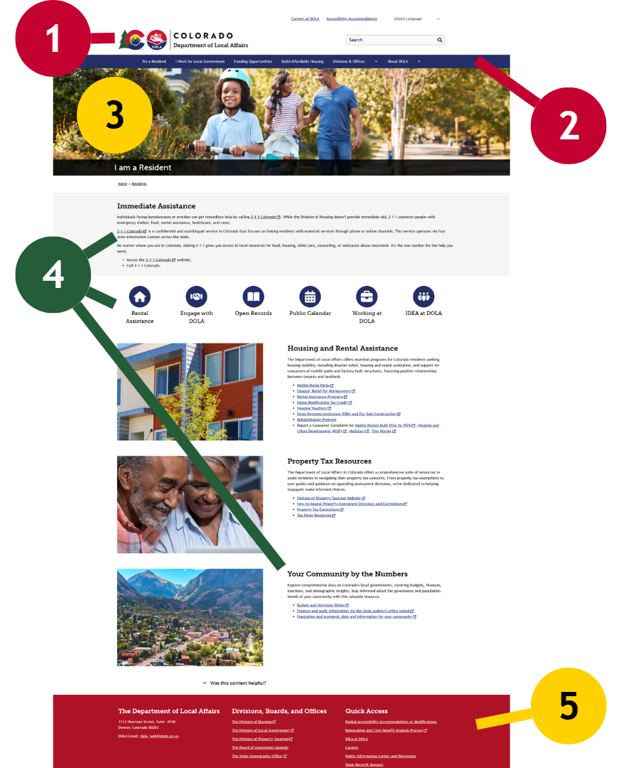
Drupal (Colorado.gov)
The Department of Local Affairs “I am a Resident” landing pages includes key features and qualities that promote a positive user experience and support the State’s brand. Examples include:
- Consistent and Branded: The agency's logo (aka logo lock-up) included in the top-left corner. This location is the most consistently used across State resources.
- Purposeful Primary Navigation: DOLA has arranged their primary navigation in a distinct, clear, and goal-oriented way. Navigation categories include:
- I'm a Resident
- I work for Local Government
- Funding Opportunities
- Build Affordable Housing
- Divisions & Offices
- About DOLA
- High resolution images to set the tone. DOLA leveraged a hero component with appropriate "resident" imagery.
- Clear user-centered calls to action. DOLA has organized 3 content areas by user needs, plainly identifying each topic of action or information. For longer lists of resources, they've added simple and understandable headings.
- Additional Wayfinding. DOLA's omnipresent footer navigation provides one-click access to highly relevant resources and commonly accessed content.
Google Sites
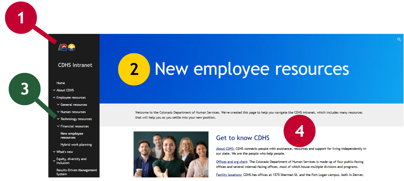
The Department of Personnel & Administration’s Intranet, MyDPA, has been designed to help employees get the information (or access) they need quickly.
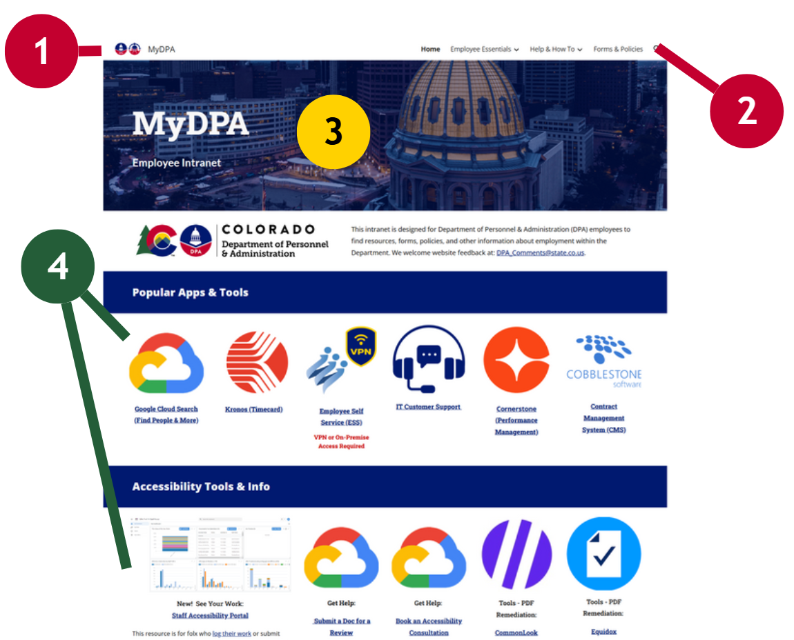
- Consistent and Branded: The agency's resource-specific logo is located in the top-left corner. All colors in use were derived from the State Brand Guidelines.
- Purposeful Primary Navigation: MyDPA is organized into 3 basic categories. Topics are arranged alphabetically.
- Employee Essentials
- Help & How To
- Forms & Policies
- High resolution images to set the tone. DPA's choice of imagery is professional and has been altered to enhance contrast.
- Clear user-centered calls to action. MyDPA's homepage includes distinct content areas that are clearly labeled with headings. These include:
- Popular Apps & Tools
- Accessibility Tools & Info
- Connect
- News & Notes
- Peer Recognition
- Around DPA
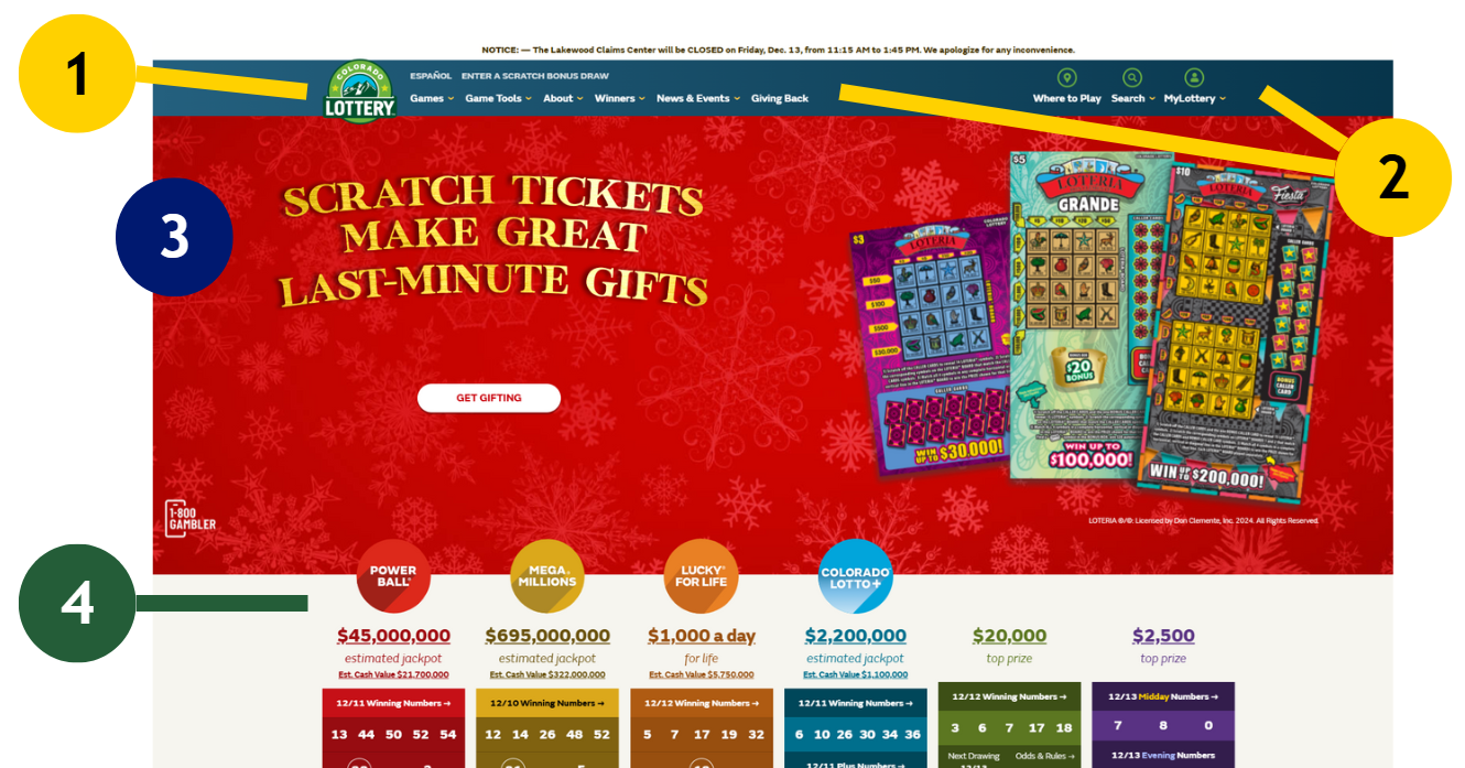
Other Platforms
- Consistent and Branded: The agency's resource-specific logo is located in the top-left corner. A majority of colors in use were derived from the State Brand Guidelines.
- Purposeful Primary and Utility Navigation: Users can quickly access well organized content, tools, and user account resources.
- Appropriate use of images. An interactive hero includes a meaningful theme, appropriate graphics, and a clear call to action.
- Grid usage. Distinct topics are arranged in a grid and clearly labeled to help users digest important information.
Content Pages
Drupal (Colorado.gov)
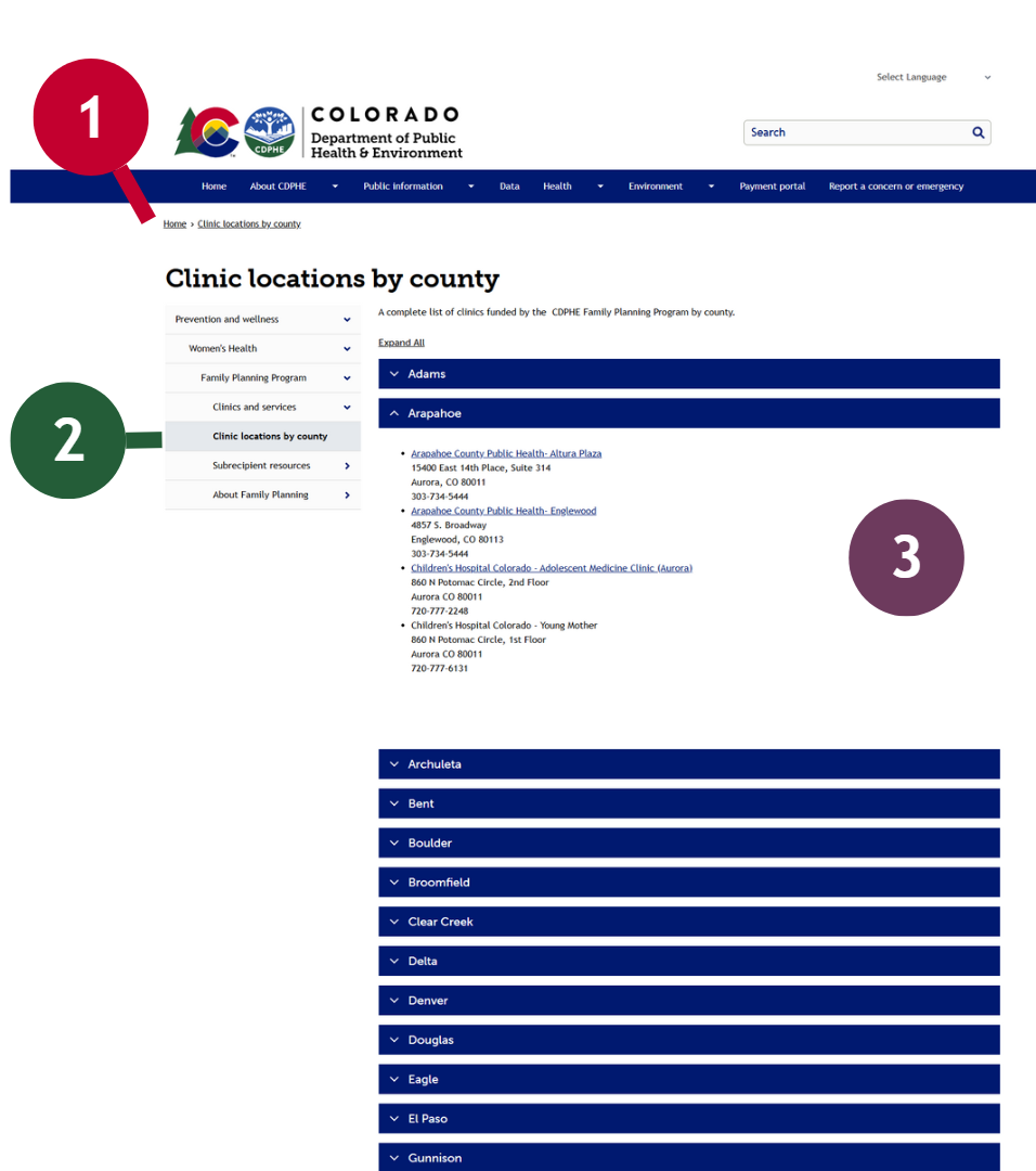
The Colorado Department of Public Health & Environment's "Clinic locations by county" content page uses components thoughtfully and appropriately.
- Additional Wayfinding: CDPHE has included breadcrumbs on their content page. It is worth noting, however, that the breadcrumbs are incomplete as they do not reflect the content hierarchy.
- Meaningful Hierarchy and use of Secondary (Side) Navigation: CDPHE's content has a clear and understandable structure, with topics increasing in specificity. Users can easily access related content.
- Appropriate use of Accordions. This page features resource directories for all Colorado counties. That is a lot of information. Using accordions here helps visitors quickly opt in to only the information that helps them get to their goal.
Google Sites
These Intranet pages take different approaches while providing targeted information and intuitive navigation options. Both Intranets include search options that are always available to employees.
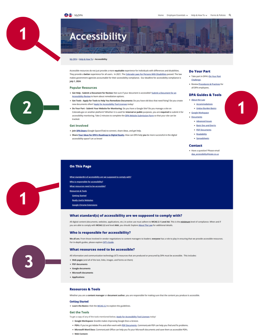
- Additional Wayfinding: MyDPA uses breadcrumbs, side navigation, and Google's table of contents (in-page navigation) to ensure that users can get to the information they need quickly.
- Content Introduction: Content summaries are useful. DPA introduces the topic of their page and offers key takeaways and resources for those who don't scroll.
- Meaningful Headings. This page opens with common FAQs, labeled with headings, and progresses into more detailed information. Content is meaningfully organized into small digestible bits.
- Consistent and Identifiable: This resource included its agency's logo in a predictable spot.
- Clear Page Titles: This content page, like many pages on the site, is titled meaningfully and briefly. Visitors don't need to wonder what content they've landed on.
- Meaningful Hierarchy and use of Secondary (Side) Navigation: Seven categories of information are presented and four of them include additional topics. The idea "layers" on this intranet are logical and
Social Media
Icons
Agency Social Media Profiles
Social media icons are traditionally included in the footer of websites and applications. For a majority of State digital assets, this placement is appropriate. For agencies or projects where engagement is a primary goal, however, you should consider placing your social media icons in the header. Wherever you place your social media icons, be consistent and incorporate all applicable best practices (including the use of alternative text, adequate contrast, etc.).
Recommendations
- 48px by 48px on mobile devices (44px by 44px minimum)
- 32px by 32px in header or footer on desktop devices (24px by 24px minimum)
- Equal gaps of 10 to 12px between icons (8px minimum)
- Monochrome or brand colors for all icons. Try to avoid using "mix and match" icons with varying styles. Using a single icon library is highly recommended.
- Opt for compressed SVGs over alternatives (icon fonts, JPGs, PNGs, etc.)
Share Links (Contextual or Content Specific)
If you are using "share" links on your content, make sure that they are located near or adjacent to the content you are encouraging people to share. Share links must be appropriately labeled to avoid confusion with access to your primary social profiles and should, when possible, meet the same aesthetic recommendations as your primary social links.
Feeds
Embeds
On most platforms, including real-time social media feeds via embeds (usually provided by your social media platform) is strongly discouraged. While it is certainly beneficial to show that you have an active social presence, embedding feeds can negatively impact performance, accessibility, and brand compliance. Embedded feeds can also introduce privacy issues. If you feel like you must include embedded social media content - which, again, is not recommended - then you should:
- Provide a skip link for screen reader users.
- Use lazy loading and provide a visible loading status.
- Test (and re-test) keyboard navigation.
- Consider disabling feeds for low data users (prefers-reduced-data).
Other Ways to Share
- Go Server Side. If you have the ability to exploit APIs or otherwise use server-side technologies to fetch and share your social media content, do so. You'll be able to ensure accessible and brand compliant presentations while still giving people access to your latest content.
- Create Your Own Highlights. You can mirror content on your site using native tools and link to the relevant external posts. This would let people know you're active, give them easy access to your content, and allow you to provide a performant, accessible, and consistent experience.